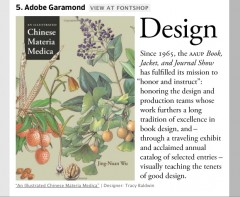
One of the most common questions that indie authors ask: which fonts should I use in my book?
The typefaces you use matter. They set the tone for your book. They affect readability. And they hint at your level of professionalism.
But if you haven’t paid much attention to typefaces, you probably don’t have a particularly sophisticated eye. If you haven’t played with glyphs, serifs, kerning, leading, ligatures, m-boxes, x-heights, you are at a disadvantage when it comes to choosing fonts for your book.
Wikibooks has a nice intro to choosing book fonts, which includes a number of excellent “rules,” including:
- Avoid using too many fonts; three is probably enough for most books
- Use unusual fonts only in short bursts—on covers, title pages, chapter headings
- Spend some time in a bookstore looking at the typefaces of well-designed books. (Typefaces are often noted on the jacket or in the back matter of a book.)
But following rules too closely (Wikibooks recommends using 11 pt Palatino for text and 14 pt Helvetica for section headers) can result in a book with a cookie-cutter look.
June Escada of PhotoshopBuzz recently tipped me off to some excellent sites where you can learn more about typography and get fonts for your projects. Check out her post What Happened to Fontfeed.
